Home
The Mailjet Blog
Email best practices
Write Responsive Emails To Drive Conversions With These 5 Tips
Email best practices
Responsive emails: Five things to avoid when writing them
Well-designed, responsive marketing emails provide the most benefit, offering improved click-through rates (CTR) and increased awareness of your brand. When you send them, you have the peace of mind that anyone can read them, including mobile users.

PUBLISHED ON
Email marketing is one of the most effective ways to create and maintain relationships with your audience.
But when you create an email newsletter to promote your company, it’s essential that recipients can view it clearly, no matter what device they use: a phone, tablet, laptop, or desktop computer.
And if your digital marketing materials aren't responsive, your brand could be missing out on meaningful business when users can't read what you're sending.
Let's look more closely at responsive emails and five things to avoid when designing them.
Table of contents
1. Avoid using multiple columns
2. Avoid using large images
3. Don’t make CTAs hard to spot
4. Don’t use small fonts and large paragraphs
5. Don’t design without structure
What is responsive email?
When you open a responsive email, it seamlessly adjusts to any device. Whether you click on an email on your laptop computer or use an app on your phone, the email opens correctly.
A responsive email varies its size, margin, font, style, and format on different devices and email clients. Responsive emails can build customer confidence in your email marketing campaigns because they demonstrate your brand's expertise and ability to employ varying marketing channels.
But the most significant aspect of responsive email design is that your customers can always view your messages, and you can effectively communicate your company's features and benefits.
Knowing that your marketing emails are always displayed on the recipient's device properly – whether they use iOS, Gmail, or Apple Mail – gives you confidence that potential customers view essential information on how your company can help them.
Responsive email is here to stay
With the popularity of mobile devices, it's essential to use responsive email design. That way, all of your brand's marketing communications reach your customers clearly and effectively, highlighting the messages you want to express to them.
When you set out to create a digital marketing email, designing for mobile devices from the start ensures an appealing, crisp display no matter the device used by the recipient. A responsive email design that works well on a mobile device will come through loud and clear on a laptop or desktop computer, too.
Since sending responsive emails is essential to a successful marketing strategy, proper implementation is key. Let's look at five things to avoid when creating them.
Five things to avoid in responsive emails
1. Avoid using multiple columns
When designing an email layout, it’s easy to feel like it’s a great opportunity to be creative. We channel our inner artist and use multiple columns, unique background colors, cat GIFs, and pictures, only to see them displayed incorrectly when opened on small screens.
While seeming like a great way to convey multiple messages to your customers, multiple columns may appear disorganized and lack clarity when opened on specific devices.
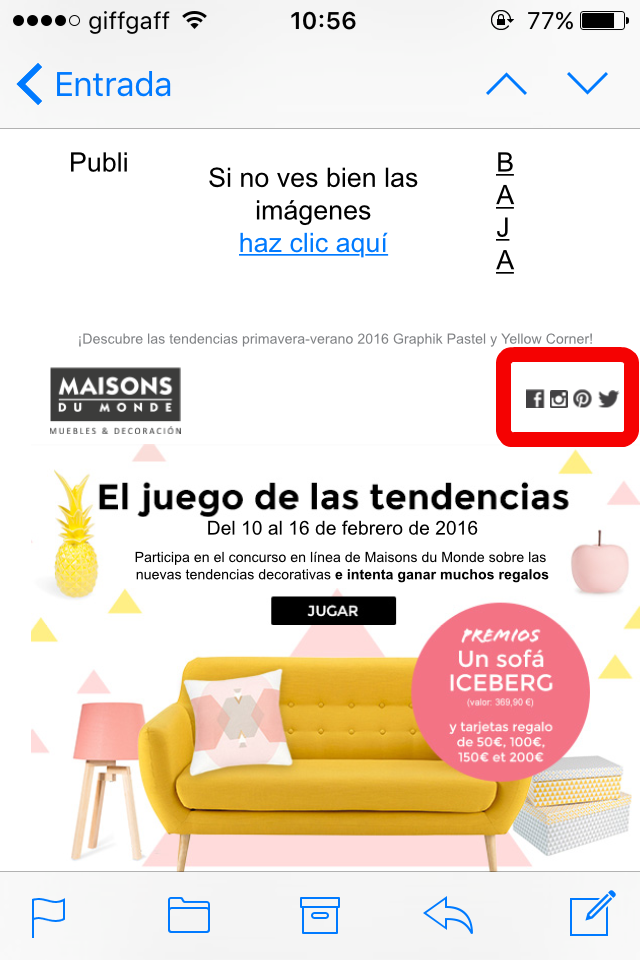
When it comes to mobile devices, simplicity is your ally. Opting for a single-column layout will prevent you from rearranging the design to create versions for smaller screen sizes. Look at these layout fails, taken from our own inbox.

2. Avoid using large images
Images (and GIFs) are a great way to break up big chunks of text. However, images can potentially be a double-edged sword. Pictures that don't render correctly can appear too big or too small on some devices, ruining your background or making your banner unreadable.
Since images are a great way of communicating information about your email marketing campaign’s mission, ensuring they display correctly can go a long way toward expressing your message.

Similarly, watch out for images that are too large and don't load properly when using data plans without 4G. Edit and optimize your images for the web before uploading them, and don't forget to add ALT text.
3. Don’t make CTAs hard to spot
Without clear instructions to recipients, it's hard to invite them to your website or product pages. That’s where you need to get clever with adding links to your email campaigns.
That's also why calls-to-action (CTAs) and links need to be easily identifiable and perfectly targeted. Think of the size and the position: not too many and not too cramped. And a sans-serif font, like Arial, makes your CTA easy to read.
Use buttons for your primary CTAs, so recipients can easily tap them with a finger on phones and tablets. Try to be creative with other areas to use links, such as secondary CTAs within the text or images as clickable links.

4. Don’t use small fonts and large paragraphs
Phones don’t work well for reading large blocks of text. Imagine creating a marketing email newsletter with essential facts, figures, and info on your company. Without a responsive design or with small fonts and large paragraphs, recipients can't view your masterpiece on their phones.
Before responsive emails became a standard, mobile-optimized emails and websites would be cramped to fit different screens without adapting the layout, content, and images. Now, we’ve learned why it’s important to make these elements responsive to ensure our messages fit the device width and look their best on any sized screen.
Text is one of those things that should always adapt to ensure people opening messages on the go don't get overwhelmed or put off by small fonts and long paragraphs.
But, there are still emails out there that look like chapters in a novel.

Provide a snippet of the text and invite recipients to read the full article on your blog.
5. Don’t design without structure
On a web browser, different techniques catch readers' attention: using colors, eye-catching pictures, stylish fonts, etc. But when it comes to smaller screens, such as smartphones, the hierarchy needs to be clear to ensure your readers find your key message, even if they don't scroll down.
With people receiving so many emails every day, the competition is stiff. And it's becoming increasingly difficult to get people to read an entire email. As such, you should always design your email in order of importance, with the most relevant elements first.
Like the menu at your favorite restaurant lists drinks, appetizers, entrees, and desserts, a well-crafted marketing email logically lays out what your audience needs to see.
That way, your emails relay essential information straight to the customer without losing them in a disorganized array of images, text, and links.

Don’t forget responsive landing pages
You're nearly there: You've crafted a beautiful email design and tested it on various devices, and you’re ready to send – but hold on. What about the landing pages once they click your CTA?
Even if you've succeeded and managed to captivate your readers, a non-responsive landing page can ruin your efforts. Research shows that even though mobile devices drive open rates up, most conversions actually come from the desktop. Your emails and landing pages need to be responsive, so your readers have a great user experience, regardless of the device.
Once you design your responsive marketing email, you must test it across various devices. Doing so gives you concrete data that your messages appear as they should, and your audience can view essential info about your brand.
You can do that the old-fashioned way by sending your marketing email to various devices and seeing how they work. But when you design your emails with Mailjet, you can preview them on various devices, including mobile phones, tablets, desktops, and laptops.
Use Mailjet to create responsive emails
Finding ways to help your company succeed takes time and effort, and you may have multiple responsibilities. When you need to design responsive emails that reach customers across a wide range of devices, Mailjet has all the tools you need.
Email Editor offers the simplicity of drag-and-drop design, allowing you to fine-tune the look and feel of your responsive marketing emails instead of learning how to use complex software. Or, you can use one of our responsive email templates for a great-looking newsletter that captures your audience's attention.


