Email Best Practices
Create winning email campaigns by learning from your past mistakes
Learning from your mistakes is especially true in email marketing.

PUBLISHED ON
Penicillin. The Slinky. Post-its. All brilliant inventions created by mistake.
Penicillin was discovered after scientist Alexander Fleming accidently left some dirty petri dishes in his lab over vacation. The Slinky was born after a naval engineer accidently knocked some springs off a shelf. Post-its were actually the opposite of what the 3M laboratory was trying to create at the time. Sometimes innovation is made by mistake, other times, innovation is born out of learning from your mistakes. In the startup world, we even have a word for this: flearn (fail + learn)! And learning from your mistakes is especially true in email marketing.

©BK
Even the best email rockstars will see campaigns with low KPIs from time to time. The difference is what you choose to do with this information. Learning from these “misses” can help you narrow down what your customer isn’t interested in and learn what type of content they’d like to see.
**Creating a frame of reference**
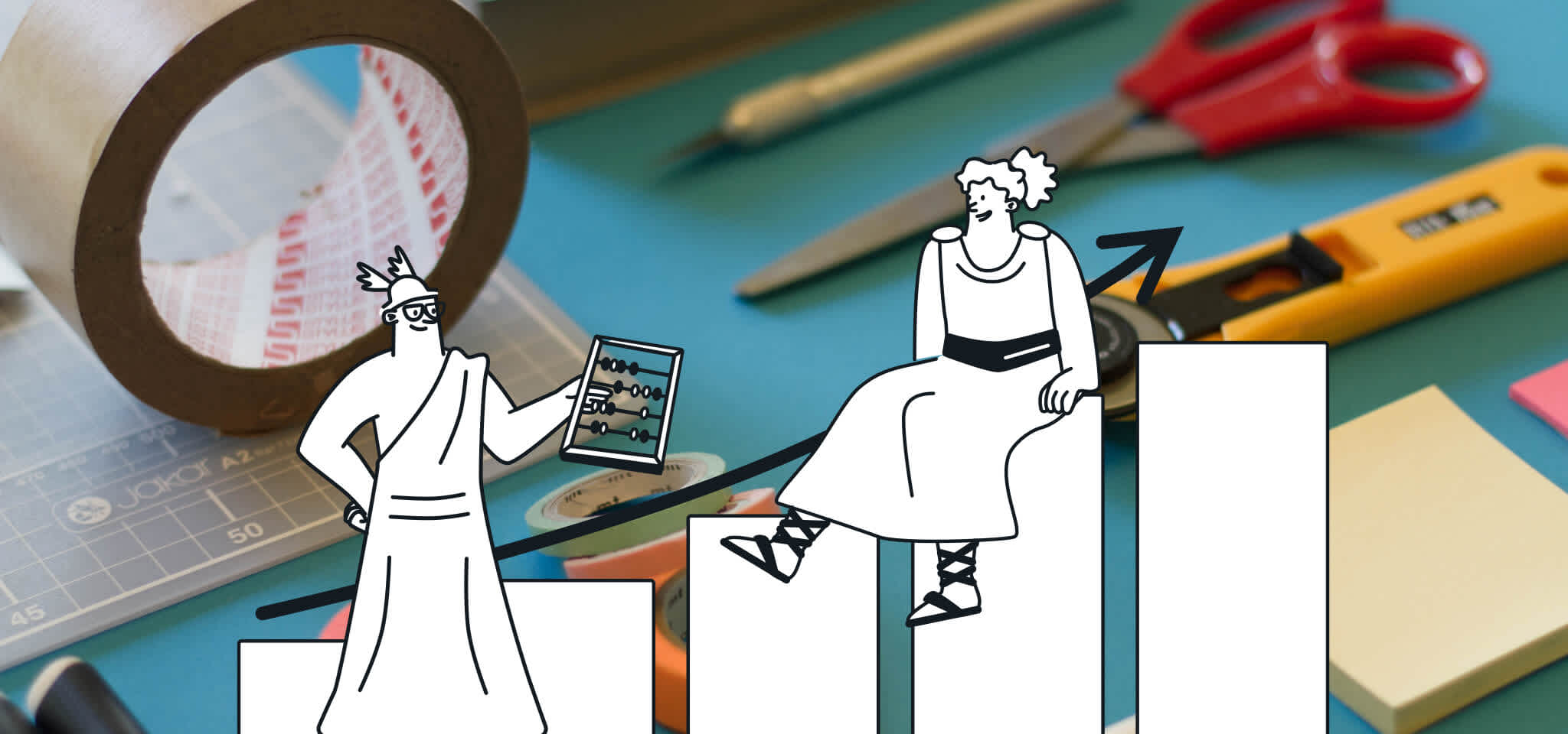
To start, aggregate past campaigns and average their KPIs to create what we call a benchmark. This will be a helpful reference as you look through individual email sends. Any part of the email that produces KPIs exceeding benchmark numbers can be quickly identified as content you should reuse.
Remember to regularly create new benchmarks as these metrics can change depending on how frequently you communicate with your customers.
**Moral of the story**
Overtime, you’ll be able to see trends while comparing across campaigns; which topic or timing works best with which audience group. The goals you should set for your email campaigns really vary by industry and business model, but generally speaking, you should aim to drive customers to engage on other channels (website, social media). Create clear call-to-actions and make it easy for customers to share.
**Don’t do it all on your own**
It can be a lot of data to juggle on your own, to save time and resources, be sure to use a tool like Campaign Comparison to do the heavy lifting for you.

With our Campaign Comparison feature, you can see your statistics in two different displays.
The classical “historical” display shows a line graph with a time scale (24 hours/7 days). This high level approach will allow you to quickly see performance over time and determine where activity peaked.
The second type of display is the “cumulative” display. This chart is continuously updating, each time you send a new email campaign, the data is automatically logged into this display. Why is this so interesting? Because this allows you to determine how many people reacted to your message on a global scale, which percentage of the people you sent your campaign to actually opened or clicked? This display allows you to compare the result of your campaigns with your ultimate objective (100% open and click rate, right?).
Obviously, comparing the performance of your previous campaigns is the best way to learn how to improve your performances. Don’t send in the dark anymore! Send, compare, learn and send better! Let us know what you’ve learned from your historical data and how you’ve improved your email program with this data!


