Email best practices
How I learned to code an email from scratch
I, a marketer, spent two weeks learning how to code an email in HTML, from scratch. Here's what I learned and what to look out for when you're starting out.

PUBLISHED ON
They say to really learn a language, the best thing to do is to immerse yourself in the culture. If this is true for languages, then it’s most certainly true for learning HTML, right? Which to me, a marketer, is as foreign of a language there is.
At Mailjet, we use our handy WYSIWYG template editor to build emails, but there are snippets of HTML that we inject to jazz up certain parts. The past few months I’ve noticed that we’ve been sending our designer smaller tasks - creating nesting tables, resizing images, building email banners - which eat up time from the larger product projects. What if I, as an email marketer, were able to comfortably work with both the WYSIWYG editor and HTML myself?
This was the beginning of a two-week long cram session of learning to code an email from scratch. Here’s what I learned:
First things first
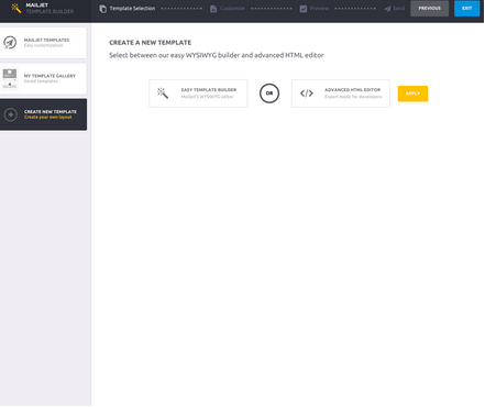
First, you can start off with a new plain HTML document (a text document saved with the extension ‘.html’) or simply work out of your email service provider. I worked directly out of Mailjet’s advanced HTML editor. We’ll be creating the header using a standard format such as the one below. The header tells the browser how to read our document - specifying what language it is and which version it’s written in.

Coding in HTML is a lot like drafting an outline for a blog post - you have to identify the intro (or header), the body (the frame) and the conclusion (the footer). Browsers like when these parts are clearly identified so that they know how to piece it together into a cohesive email design.
Building the frame: it’s all a grid
Then, we’re ready to dig in and start our grid. Like all good design, working off of a grid helps create aesthetic balance, helps you organize your content and most of all ensures responsiveness. A grid email design can be easily restacked into a single-column design on smaller screens.
To build my grid design, I had to learn how to code tables. Here’s where it got tricky for me - it’s hard to imagine turning something visual like a table into text!
Start off with a sketch
The first mistake I made was jumping head on into the code without having first laid out a sketch. Tables can be difficult to visualize once you start coding, so it’s extremely helpful to have an idea of how much content you’ll want to include and how you would like to arrange it. Each separate piece of content, whether image or text, will generally need to be coded as it’s own cell in the table.
Coding the table
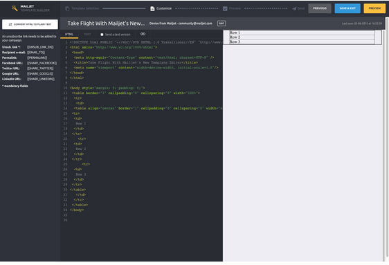
Now for the code, <tr> stands for “table row” and <td> stands for “table data” or column. Use <tr> to create a new row, followed with <td> and the text you’d like to add to the cell.

Here’s the first frame that will hold the rest of the email content.

To add more sections within the frame, simply follow the format we used to create the initial table above. I copy and pasted two additional rows. So now we have a larger frame and an inner set of three rows.
Filling out the details
Throwing another language in the mix
The email frame we just reviewed was all in HTML, but for styling, we’ll have to turn to another language, CSS (Cascading Style Sheets). The two are generally paired together for website and email building because HTML creates the structure, while CSS describes the visual details such as color and fonts.
To further complicate things, most email clients do not play well with CSS. There are inconsistencies in the way they render CSS. For example, Gmail strips out any CSS that is included in the header of an email, but Outlook accepts <style> tags in the <head> and <body>. This sure confused me! Email clients don’t like CSS but we have to use it to style anyways?
It turns out there are several types of CSS, but for our intents and purposes, I’ll just introduce inline-CSS. Because inline-CSS is applied to each individual HTML tag, it renders correctly.
If you happen to have all of your styles already coded into your header, there are plenty of handy tools that can “inline” the code for you.
Adding the header image and color
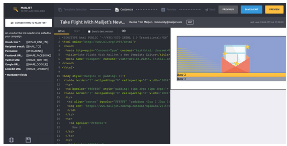
Below, I’ve added the header image to the email with the <img src= “link”> tag.
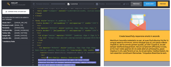
Furthermore, I’ve adjusted the background color of Row 2 & 3 with Mailjet gold <bgcolor=”#ffbf40”> and gray <bgcolor=“#989dac”>. In a little while I’ll be building these two rows out to create the body of my email.
Padding
In order to flesh out the rest of the email body, we’ll need to add some padding. For example,“style=”padding: 40px 30px 40px 30px;”> tells the email client how we want the top, right, bottom and left to be spaced respectively.
Social sharing links
To finish off the body of the email, I added in an extra row at the bottom to include social links. Always include social links - it takes a few seconds to slot in and not only helps drive additional traffic to your other social channels but it also extends the reach of your email content.


Unsubscribe link
Last but not least, don’t forget to include an unsubscribe link at the bottom of every email! Mailjet handily reminds you if you forget to add one before moving on to the next step:


Using the unsubscribe link provided above, I added an href attribute, which tells the email client which link to add to the text.
Trial and Error
Above all, be patient when you’re just starting out. Sometimes you’ll miss a closing tag or add an extra character that breaks the design. Hint: look for odd colors in the syntax highlighting!
Mailjet’s HTML builder allows you to preview what your campaign will look like on various screen sizes. I can also send a test to myself. I checked my code each step of the way to make sure the design rendered just the way I wanted it. If anything was unaligned or broken in the preview, I could immediately go back and fix it.

Wrapping Up
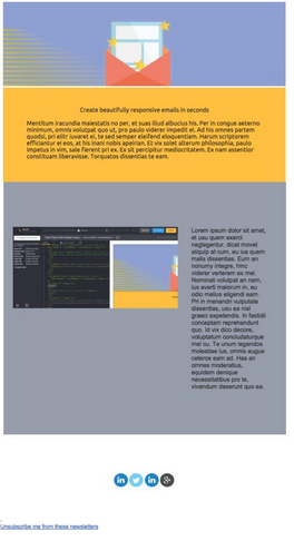
And there we have it, the finished product. All in all, it took me a good three hours to complete this simple layout below! Unless you are looking for something highly customized, starting off with the WYSIWYG editor and injecting HTML when needed may be a more efficient process.
How often does your team code emails from scratch?
The Mailjet team has been hard at work building a new easier, faster way to create beautiful emails. Keep an eye out for an announcement in a few weeks!


