Email Best Practices
Responsive design: How to make your holiday emails fit down every chimney
Learn the importance of responsive design for email templates and how to create one to make sure it fits beautifully on all kinds of devices.
PUBLISHED ON
We don’t have to tell you how important it is to have a design that is multi-device friendly - the numbers speak for themselves. Today, 65% of emails are first opened on a mobile device. And with 75% of readers highly likely to delete emails that are not optimized for the third screen, you really only have one chance of getting your message through to your audience. That means: adapt to your environment.
Here are a few tips on how to design responsive email and thereby make your emails efficient on all kinds of platforms:
Keep it simple
From the moment you start putting together the first drafts for your email layout, keep one word in mind: simplicity. Keeping your design simple is the first step towards creating an email design that will work on as many devices and screen resolutions as possible. And by simple we mean stripping your layout of any unnecessary elements. Think about what the essential parts of your layout are and stick to them. Scrap everything that is redundant or irrelevant to the core message in your email.
This also applies to your use of images. Make sure your email isn’t cluttered with images and try to limit the amount used in your design. Also consider your use of text: make your copy short and precise, and use short paragraphs of text so readers can easily and quickly scan through your email. You may want to test what the right amount of copy is for your readers and at what length engagement starts to drop off. Examples:

Here’s an example of a simple email design by Square. The email contains only the essential images and text blocks and works great on a mobile device, as seen here.
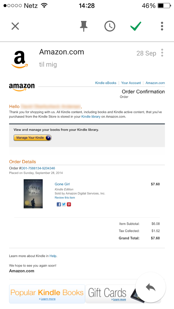
This email from Amazon makes use of quite a few different elements - texts of different size, links, buttons, images - but ultimately not optimized for a small screen.
Adapt a single-column layout
Since most mobile devices today have a vertical screen design and are primarily being used while held upright, there isn’t a lot of room for wide email designs. Emails that are designed with multiple columns can therefore be an issue when displayed on these smaller screens. To handle the wide layout, mobile email browsers shrink down everything in the emails, which makes it difficult for users to read them.
As a solution, design your emails with just a single column. By doing so, you’ll be sure that mobile browsers and email clients can display the contents of your email correctly and in the right proportions. A single column email is similar to native mobile apps in that it only requires users to scroll up or down, thereby making the user experience simpler and more intuitive.
Examples:
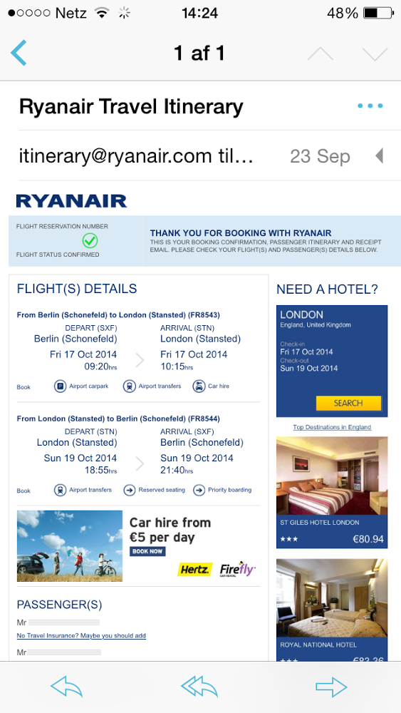
This example from Ryanair shows how a multi-column email looks on a smaller screen. The phone is cleverly programmed to automatically shrink images and text to fit the screen, but this makes the email is difficult to read.

This newsletter from Product Hunt uses just a single column, making the email easy to read on mobile devices.
Make your call to actions clear and easy to tap
A crucial element of any email design is the call to action (CTA), which is added to encourage readers to click on a button or image. When designing CTAs for responsive designs, it’s especially important to take into account the different screens and platforms your email might be shown on to ensure that the CTA works in a range of device scenarios.
When creating your layout, make sure that your CTA buttons are large and stand out with a color that contrasts your background so they are easily spotted in your email. To make your CTA work on mobile devices as well as computers, make sure it’s large enough to tap with a finger.
Examples:


Here are two great examples from Airbnb and Duolingo that make use of CTAs that catch the eye and are large enough for mobile users to tap on a smaller screen.
Bonus tip:
Don’t forget to test
Once you have put your design together, it’s essential that you try it out in different scenarios. View your layout on a variety of screen sizes, resolutions and devices to see how well it works. This will give you the opportunity to make changes where needed before the layout is implemented.
Want to define your email strategy to win customers over this holiday season? Check out Mailjet's Ultimate Guide To Holiday Emailing.


