Email best practices
The top email clients and apps of 2021
How can you maximize your deliverability for the top email clients and your users' habits? We have the answers. Read more...

PUBLISHED ON
We’ve all been there – struggling to send a perfectly-targeted campaign, trying to figure out which clients our audience uses, and wondering how we can make sure our email looks and sounds great no matter where and how they’re viewing it. What can possibly solve these problems?
Luckily, if you’re struggling, we’re here to help. We recently published our report “The Path to Email Engagement in 2021,” which highlights the latest email trends and user habits – and that includes research into today’s top email clients. Since the 1990s, email has become a prime method of communication for people all over the world, with many clients to choose from.
Email sending success depends on knowing about these clients, their differences and similarities. In this article, we’ll take a look at the top providers and provide some tips on sending to them all.
Let’s continue and look up over the cutting edge of email.
Table of contents
Top email clients around the world
How people check their emails
Sending emails to Gmail
How Gmail organizes emails
Sending emails to Yahoo
Sending emails to Outlook
The most popular email clients and platforms of 2021
To begin our email client journey, let’s take a look at the most popular email clients and platforms. Like most things email, there is no one-size-fits-all answer (i.e., everyone uses AOL Mail!) that we can pinpoint. However, there are useful trends that offer us insight into global user habits.
The popularity of email clients and platforms differs by location, and many people have more than one email address. This means that, when sending, you should be aware of which providers your audience is using the most.
Top email clients around the world
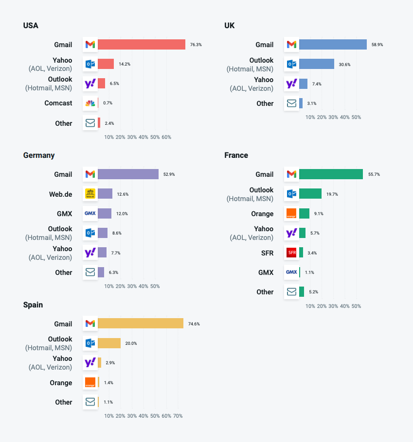
Our research revealed that, overall, Gmail remained the most popular email client – 65.3% of our global respondents reported using it. It’s most popular in the United States (its country of origin, so not too surprising) and Spain. 76.3% of American respondents and 74.6% of Spanish respondents reported using Gmail. On the other hand, it’s least popular in Germany, capturing “only” 52.9% of users.
When it comes to second-choice providers, different locations had different favorites. In the United States, Yahoo is the second-choice option for personal emails (14.2% of users). Outlook takes a healthy third place (6.5%), and Comcast is last with a barely-there 0.7% of users.
In Europe, Outlook is the more popular second choice in France, Spain, and the UK (with 19.7%, 20%, and 30.6% of users respectively). It’s third in Germany (12.6%), just behind Germany’s Web.de client. If you’re sending to European countries, you won’t find many Yahoo addresses in your lists: Yahoo is a distant third in all European countries, with a single-digit presence in each location.
How people check their emails
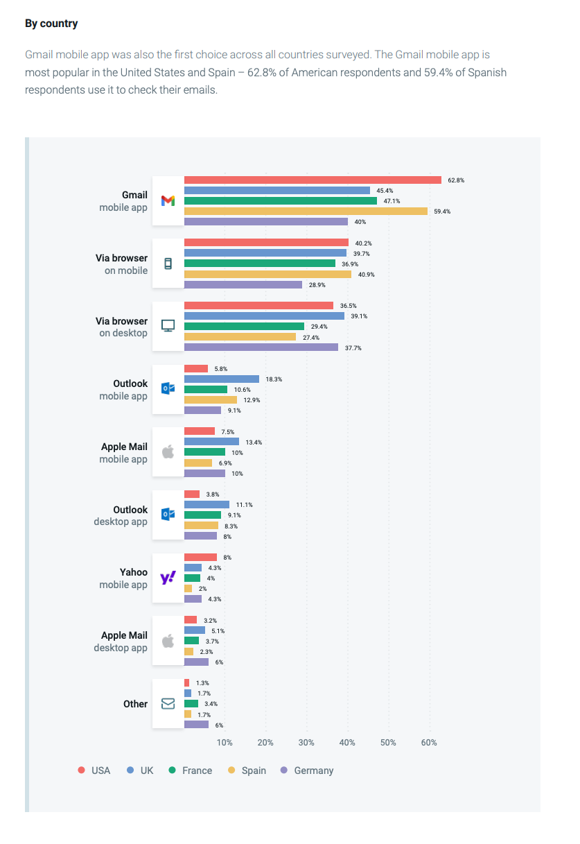
When it comes to the platforms people use for these clients, mobile is still the most popular way to check emails overall. Gmail’s mobile app is the most popular app used to check email (which makes sense, given Gmail’s overall huge popularity). However, mobile is just one part of the story.
Most people don’t check their emails only on one platform. They use a mix of mobile and desktop depending on what’s convenient (in line at the store? Mobile. Working on your laptop? Desktop). Also, when it comes to desktop email, checking email via browser has a big lead over checking via app.
This data gives senders an important message – do not ignore either mobile or desktop platforms, or browser or app usage when creating email. Some may be more popular than others, but all have enough audience share to justify making sure that your messages look great everywhere.
Okay, now that we all know a little more about general email usage, let’s take a look at the top three email providers, how they organize mail, and some best practices for each.
What to remember when sending to the main email clients
You might be wondering: Does it really matter whether or not you follow certain practices for each email client? After all, they’re mostly the same, right?
Sorry, you’re not off the hook. While the main email clients have many similarities, it’s important to remember that they all have differences in layout and message rendering that can affect your emails. Let’s explore how each email client displays mail, and look at a few tips for sending to each.
Sending emails to Gmail
Unsurprisingly, the ubiquitous Gmail is still the king of the email clients (you may even have it pulled up via app or browser right now). As we’ve mentioned, a whopping 65.3% of global email users use Gmail, and it’s the leading client across all of our surveyed countries. 76.3% of our American respondents use it, and its lowest showing in Europe was a 52.9% share in Germany – still over half of respondents. It’s kind of a big deal.
In both mobile and desktop formats, users can choose to enable or disable the Tabs feature. About half of Gmail users (53.3%) use Tabs to sort their mail, and the other half leave their mail unsorted. While the Tabs feature isn’t used by everyone, it’s still a factor you need to keep in mind when planning for better deliverability. Most people (79.7% globally) check it at least once a week, and half (51%) do it daily.
How Gmail organizes emails
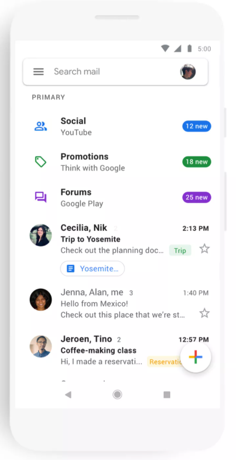
Gmail uses Gmail Tabs to organize its recipients’ mail into a series of categories. These tabs include Primary mail, Promotions (which includes marketing emails like yours and brand offers and discounts), Social (which includes social media notifications and dating and social websites), and more. If you want to check what tab your email will land in, leverage tools like Mailgun’s Inbox Placement.
Typical Gmail mobile and desktop layouts are shown below.
A Gmail mobile layout with tabs enabled:
Source: Android Police
A Gmail desktop layout with tabs enabled:

Source: The Verge
What you should remember when emailing Gmail users
Google caches all email images, which makes them display similarly across all devices using Gmail. This helps keep your images looking good – not too small or stretched.
To add another layer of email protection (and to build brand visibility), businesses can jump on a new standard known as BIMI. BIMI is still in its infancy, but Gmail recently launched a pilot program to support this standard.
Remember that going to the Promotions tab is not bad – it keeps your emails out of the spam folder, and placement often depends on user preference and habit. Don’t fall for email bad practices just to try to get into the Primary tab.
Since many of its senders use shared IPs, Gmail uses domain reputation to impact deliverability rather than IP reputation. Segment your promotional and transactional mail into subdomains to make it easier for Gmail to sort and deliver your mail, and to keep your main domain reputation clean.
Additionally, segmenting your mailing list positively impacts your Gmail deliverability. It helps you deliver to engaged readers and avoid spam traps, low engagement, and other deliverability traps.
Sending emails to Yahoo
Yahoo is the second-most popular client in the U.S., capturing about 14% of American email users. In Europe, it has a smaller presence ranging from 3% usage in Spain to 7.5% usage in the UK.
How Yahoo organizes emails
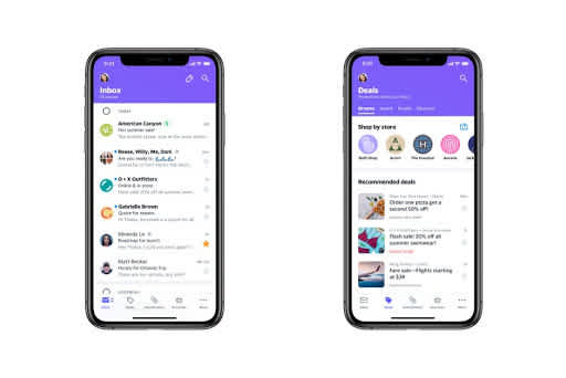
Yahoo is one of the older email clients, but in recent years it’s created a newer layout that is similar to Gmail’s. Yahoo uses a Views features that lets users see different, organized “views” of their inbox. Views include Primary mail, Deals (which is like Gmail’s Promotions for brand communications), and subscriptions (streaming services, etc.).
A Yahoo mobile layout with two different Views, the primary inbox and Deals:
Source: 9to5Mac
Like Gmail, Yahoo includes a version of its Views feature (on the left, as a sidebar) for both mobile and desktop, which lets users view sorted mail based on the same categories.
A Yahoo desktop layout with Views:

Source: TechCrunch
And now you’ve got those 90s-era Yahoo commercials stuck in your head, right? Never fear, we’re throwing it back to one more original email client.
What you should remember when emailing Yahoo users
Yahoo doesn’t cache images. Use alt-text so your readers will know what your images mean even if they don’t display properly.
It’s not the end of the world if you end up in a View as opposed to primary mail – like with Tabs, it keeps you out of the spam folder and helps optimize user experience. Craft your emails to their best deliverability advantage regardless of placement, and don’t fall for bad habits.
Remember BIMI? Yahoo is the only current adopter among the major email clients – you can take advantage of this to both build brand awareness and offer greater email protection for your clients.
Sending emails to Outlook
Like Yahoo, Outlook (aka Microsoft Outlook) has been around for a while. It’s the second-most popular email provider in Europe, boasting at least 10% of users within each country of the United Kingdom, France, Spain, and Germany.
How Outlook organizes email
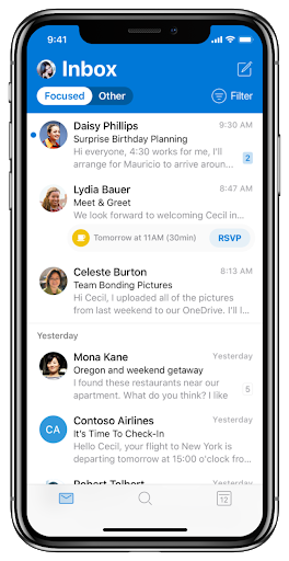
Since the ‘90s, though, Outlook’s shed its old “Hotmail” name (sad) and made changes to the way it looks for users. Now, Outlook sorts users’ mail using “focused” and “other” tabs. The focused tab is meant to do what it says – collect relevant mail (like messages from close friends, airline tickets, etc.) in one view.
An Outlook mobile layout:
Source: The Verge
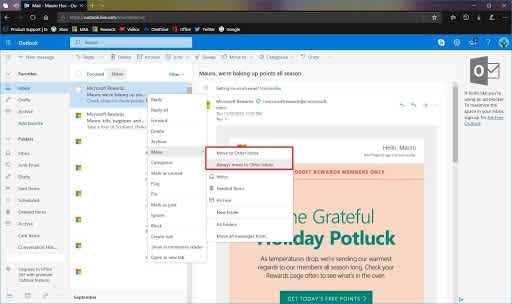
In desktop mode, Outlook follows the email client trend of offering its focused inbox feature as a setting, and users can move messages between the modes:
Source: Windows Central
What you should remember when emailing Outlook users
Don’t use background images – Outlook doesn’t recognize them. Instead, foreground your images and experiment with colors and designs for a unique look.
Use alt-text for all images. Outlook doesn’t always display images by default.
Outlook doesn’t support Amp4Email, so make sure you include a fallback in your HTML code if you’re also sending these interactive emails to Outlook users. If you want to ensure your Outlook contacts get the full experience, you’ll have to rely on Microsoft’s own language for interactive templates – Actionable Message.
How to find the top providers in your email list
What do you know, Mailjet provides an easy way to see that! If you go to your analytics dashboard and click on “show more statistics,” you’ll be able to see relevant metrics (like open rates and click-through rates) for your email lists’ top three most-used providers. All providers outside the top three will be combined into the “other” tab.

You should take note that the results will show the provider behind the domain. For example, the domain mailjet.com is displayed here as GSuite (Gmail for Pro) because mailjet.com is using Google Apps.
You can use these types of metrics for better message placement and rendering – once you know where you’re sending, you know how to optimize your resources for the most popular providers and platforms.
Email rendering tools, like Litmus, Email on Acid, or Mailjet’s Inbox Preview, can let you see how your email looks in every client. At Mailjet by Pathwire, Enterprise clients can use our Inbox Preview tool to test how their emails will display across the main email clients in their contact list.

So there you have it. No more wailing or gnashing of teeth, just sweet dreams knowing that your emails are going where they’re needed, and getting the engagement they deserve.
Wrapping up
So, it’s safe to say that there are a lot of email clients out there, and even the biggest, most mainstream ones have their differences. However, their similarities are the key to great placement at the top of the inbox. It’s easy to build a new, winning email strategy by holding onto a few key takeaways:
The top three global email providers (Gmail, Yahoo, and Outlook) all have their own layouts and rendering particularities you should pay attention to when sending. Make sure that images, designs, and support tools like BIMI are optimized for each.
Also, to both get your emails where they need to go and make sure they look good everywhere, you can use tools like Mailgun’s Inbox Placement or Mailjet’s Inbox Preview to catch message errors and optimize deliverability.
Your chances of landing in any providers’ primary inboxes greatly increases when following deliverability best practices. However, if you end up in a secondary Tab or View, it’s not the end of the world. These divisions are created for user experience, and they help protect your deliverability and keep you out of spam.
Finally, when analyzing your amazing emails after sending, you can see who your contacts’ most used providers are and use data to optimize placement and rendering in the future.
As we mentioned before, email is a hard thing to get right. But with the right information and insight on your side, you can create messages that have more staying power than a mid-90s Yahoo commercial.
Download our full email engagement research report here for more insights on email in 2021 and beyond, and join our newsletter to stay up to date on the latest trends and create amazing, long-lasting relationships for your brand.


