Home
The Mailjet Blog
Email best practices
How to write a transactional email: Best practices & examples
Email Best Practices
Create the best transactional email with these tips
Transactional emails are the bread and butter of email marketing. We’ll show how they play a vital role in customer communications and how to unlock their potential marketing avenues.

PUBLISHED ON
Once upon a time, branding didn't play much of a role in marketing emails. Before, you'd design email templates with images, tables, and inline CSS. If there were any logos at all within a promotional email, you could consider it branded.
Today, branding is a vital aspect of the customer experience. Digital touchpoints are central to communicating with your audience, so branded content in email campaigns is essential to your marketing strategy. In the following guide, we'll look at the fundamentals of transactional email branding and provide real examples, demonstrating how they facilitate an excellent user experience, from website to inbox and vice versa.
Table of contents
Squarespace
Amazon
Macy's
Mailjet’s email editor
MJML
SaaS template creator
Branding transactional emails
Transactional emails are usually the first point of contact with your audience, whether to make a purchase on your website or to register to receive updates on your app. Or, perhaps you want to send them a simple “thank you.” Making a positive first impression is vital to obtaining and maintaining customer relationships, and sending transactional messages such as order confirmations is an excellent way to do that.
Statistics show that emails with appealing branding and design enhance user experience (UX), drawing them to your company. Here's some compelling research that demonstrates the significance of well-designed transactional emails:
28% of consumers prefer emails where they can easily find the message they’re looking for.
93% of customers would consider choosing a rival brand following a negative transactional email experience.
12% of consumers say transactional emails that match a brand's website are the most important aspect of their brand journey.
Design and color are the two primary elements to consider when branding transactional emails. Here are some basics on creating messages that capture your recipients' attention:
Color – Utilizing color is one of the best ways to connect a user to your brand. Colors have the ability to reach a person's emotions, and associating certain hues with your brand sets it apart and makes it unique. Typically, brand guidelines already establish many design decisions, so it's simply a matter of choosing and applying thecolors of your choice. From promotional emails to your website and back, colors enhance your brand identity.
Persuasive copy – What's your brand’s identity? Is it professional, lighthearted, or technical? Transactional emails provide an excellent opportunity to showcase your brand's personality and communicate to customers what it's all about. In fact, maintaining the same identity across all your digital channels expresses a unique tone.
Typography – Similar to responsive design, typography has dramatically improved in email rendering. No longer are you constrained by web-safe fonts or making image sprites to match designs. Today, you can nearly match the fonts on your website and have fallbacks, just in case.
Brand collateral – While color and design are central to creating a solid brand identity, brand collateral can add extra zing to your transactional emails. Brand collateral uses different forms of media including testimonials, videos, and photography to communicate your brand's message. These elements can increase curiosity about your brand and create customer relationships. However, transactional emails are primarily about relaying information, so it's important to avoid using too much collateral.
Transactional email examples
Let's look at some well-designed examples of transactional emails and how they achieve the goal of communicating the brand's message.
Squarespace
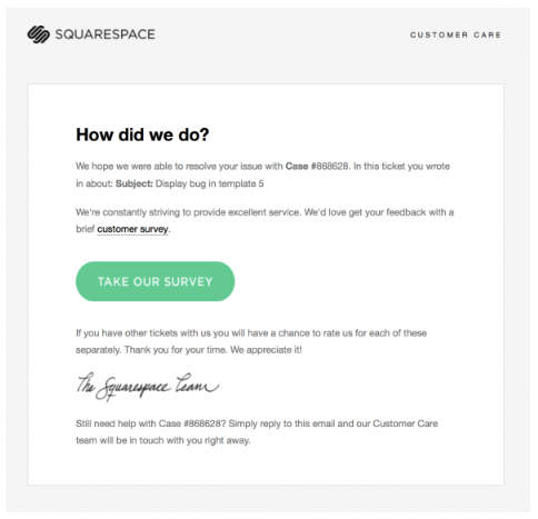
In this example, Squarespace seeks feedback from a customer, which is critical to understanding how to improve. Customers are unlikely to seek out feedback forms on a website, so transactional emails provide a good avenue for finding out what they like or dislike about your products or services. The email makes use of the Squarespace logo and font without too many additional, flashy graphical elements. A green call-to-action (CTA) highlights the survey, and the cursive signature adds a personal touch.
Amazon
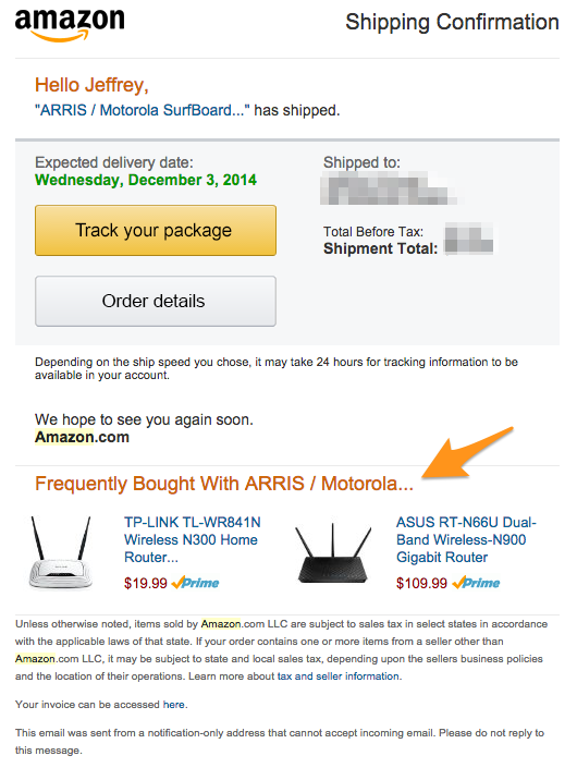
Here, Amazon sends a purchase receipt and shipping confirmation and adds in some information about related items. The graphics and fonts are easily identifiable as Amazon's and express essential pricing and package tracking information. At the bottom of the email, Amazon notes other products the customer may be interested in. This transactional email is an excellent example of conveying vital information without using fancy graphics or overly showy elements.
Macy's
Double opt-in email messages confirm user interest and can help reduce spam addresses added to your recipient list. Here, Macy's sends a double opt-in message that confirms the user's intent and offers them additional enticement with a 15% coupon. Macy's uses red throughout the email to highlight important information like the CTA and a coupon and sticks to a fun tone that encourages people to go shopping.

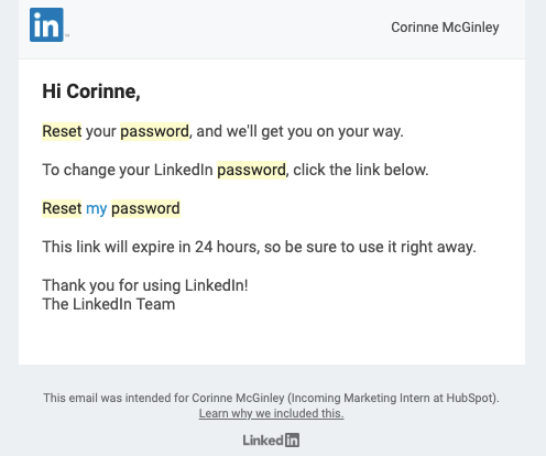
Password reset emails are another common type of transactional email because, let's face it, we've all forgotten our password at one point or another. Here, LinkedIn sends a straightforward message that includes its recognizable blue logo and clear instructions on resetting a password. The message gets to the point without using unnecessary information or graphics.
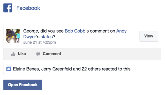
Occasionally, websites send transactional emails to indicate activity on a user's profile. One example is Facebook, which sends emails when people interact with their profile or send them a message. Users can specify how often they receive emails, but sometimes Facebook might send one anyway, encouraging them to log in and use the platform. The example below shows a transactional email notifying a user of an activity that might interest them. The color, format, and font are on-brand and easily recognizable, and the buttons give users clear ways to visit the platform.
Transactional emails with Mailjet
Transactional emails are key to increasing brand awareness and communicating with customers, and you'll need to create them on a regular basis. But when your business grows, it's good to have a system in place to generate templates as required. Here are some of the tools Mailjet offers to increase efficiency while allowing you to stay true to your brand.
Mailjet’s email editor
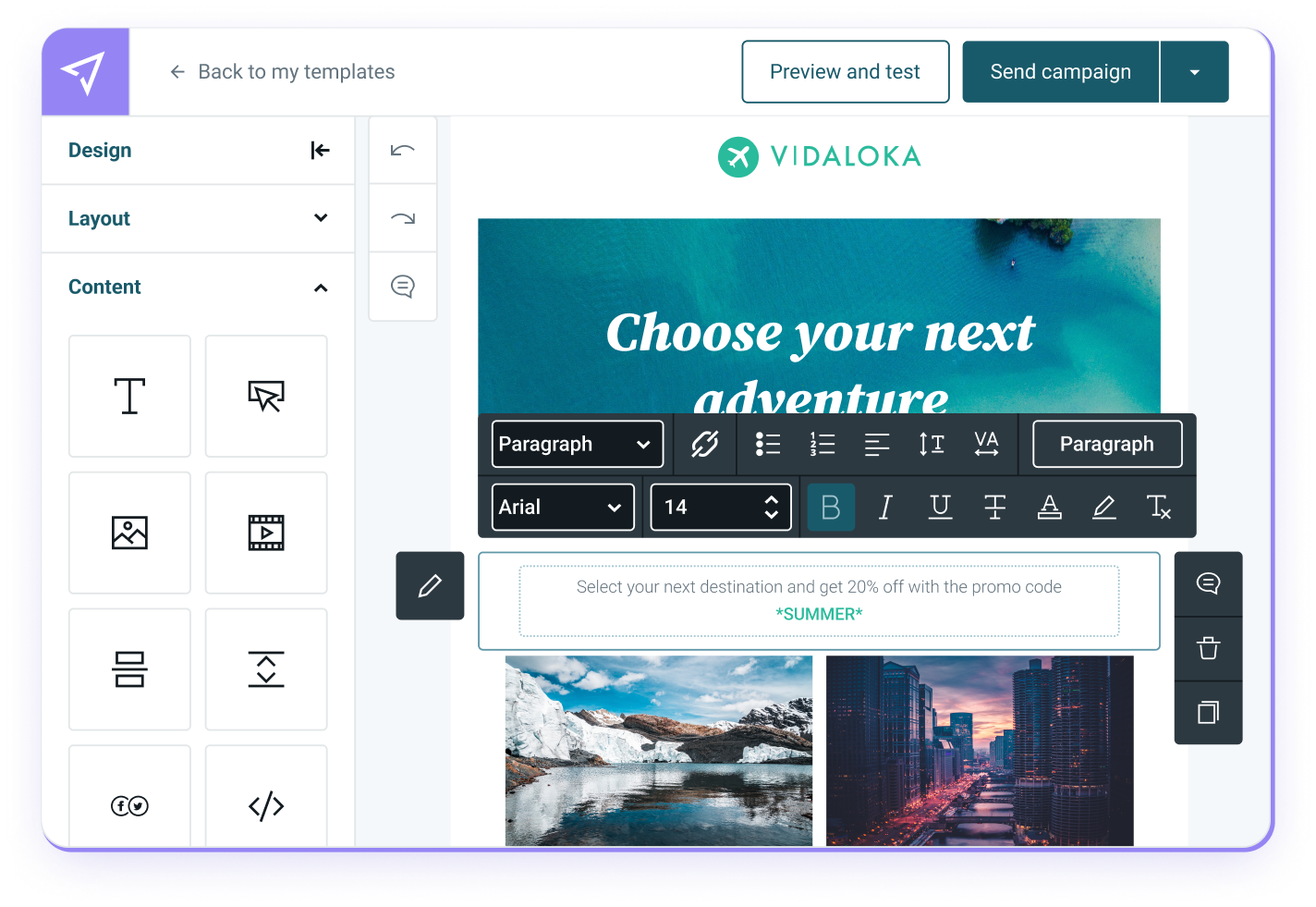
Mailjet's Email Editor is the easiest way to begin creating your own transactional emails. Its intuitive interface uses drag-and-drop blocks, real-time collaboration, and responsive email output for any device or screen size. It also allows you to save your favorite email design elements for reuse. Having one shared resource across your templates makes for consistent emails and an efficient workflow, especially if you're working in a team.
MJML
We designed our MJML language specifically for email coding, with built-in responsiveness for various screen sizes. It’s a markup language that takes some of the most popular components of email design and makes them simpler to use. That allows you and your team to create transactional emails faster, with the look and feel your company wants.
SaaS template creator
All this talk about email design may sound like a hassle, but there's a secret industry shortcut that can save you time. Our SaaS Template Creator applies all the elements of an effective transactional email and makes branded email templates for SaaS. When you have multiple responsibilities at your company, this can make your job a whole lot easier.
Wrapping up
When you need a transactional email API provider, Mailjet has the best tools for the job. By using Mailjet, you can access our templates for your emails and newsletter content, automate triggered emails in response to engagement, or launch a newsletter. Sign up today!
Transactional email
Whether you're a marketer trying to create beautiful transactional emails or a developer building a fast-sending pipeline via API calls - you need to be able to roll out your program quickly. Choosing a transactional email service provider is important, and this is where Mailjet can help.


