Email best practices
10 best welcome emails examples to onboard new users
What is a welcome email, and why should you send one? Find out here with some tips, tricks, examples and how-to’s.
PUBLISHED ON
We only get one chance to make a good first impression, right? Well, a welcome email will often be the first time a subscriber hears from your brand. Yes, they will have perhaps browsed the site, read a blog post or two but this will likely be the first time they’re contacted directly by you.
So, you want to make sure things get off to a good start. But what does that mean exactly? What should you say? What do you include in your first welcome email? Let’s take a look, shall we?
Table of contents
Ensure it’s timely
Keep it brief, but deliver on your promises
Personalize the content
Include enticing CTAs
Choose the right colors
1. InVision - The power of personalization
2. Airbnb - What’s next?
3. Evernote - Clear and catchy CTAs
4. Casper - Color you want to click on
5. Glossier - Let’s get social
6. HelloPrint - The human element
7. Mode - Get them interacting
8. Uber - Deliver the incentives
9. Sidecar – Your mission
10. Aura Bora – Welcome discount code
07
Wrap up
What is a welcome email?
A welcome email is the first email your subscribers receive after they sign up for your newsletter. It’s your chance to wow them, to give them a taste of what’s to come, and have them eagerly scrolling their inbox searching for your next campaign.
Why is it important to send welcome emails to your new users?
Beyond a welcome email being a kind and polite way to say hello, they also have some very powerful statistics behind them. Believe it or not, at 50%, welcome emails have an unusually high open rate when compared to other marketing emails.
What’s more, subscribers who receive a welcome email show 33% more engagement with the brand. Still not convinced you need to take welcome emails seriously? Well, there is a whole other more practical reason to send out welcome emails.
That reason is to continue the onboarding process your subscriber might be in the middle of. A welcome email could encourage users to do many things, like complete their profile, download content or even complete a purchase. You’ll want to check out your conversion rate for these emails to see how they’re performing.
What makes a good welcome email?
If you’re looking to get started with welcome emails, here are a few ideas to keep in mind.
Ensure it’s timely
As soon as someone signs up for your newsletter, send them that welcome email ASAP! Because they just signed up, it means they’re still online and currently looking at your brand. They are curious enough to want to know more, and your email could pull them in even further.
Our Email Automation feature will help you do just that. You’ll be able to schedule your welcome email to send out as soon as you get a new subscriber with very little effort on your part. We do the work for you.
Keep it brief, but deliver on your promises
You’ll want to engage your audience as quickly as possible, but make sure not to bore them. The content of the welcome email should be relevant, succinct, and provide some sort of value. A welcome email should set your subscribers expectations for the future. It’s the first email they’ll ever get from you, so give them a taste of what’s to come, and try to keep it consistent with the newsletter you’ll be sending out.
Additionally, if you promised something for signing up, maybe a discount code or exclusive content, now is the time to deliver! Give your customers an incentive to keep them engaged in your brand.
Personalize the content
It goes a long way! Use whatever data you have on your newest subscriber, and make that welcome email that little bit more welcoming. If you have their first name, use it either in the subject line, the body of the email, or both. Just using a first name in the subject line can increase open rates by 20%.
Personalizing welcome emails makes the correspondence feel a little more human, and a little bit less robotic. At Sinch Mailjet, it’s easy to add personalization to your marketing and transactional emails.
Include enticing CTAs
The reason behind marketing emails is to turn subscribers to customers, and your CTAs, or call-to-actions, are what’s going to do that for you. You’ll want to keep this in mind when planning out your email. Make your buttons easy to find and enticing to click on. This might mean making it pop with color, or maybe a cool GIF to go along with it.
Choose the right colors
Color is a good way to grab a subscriber’s attention and hold it. On the flip side, if the color combination is off, it could cause subscribers to lose interest. Because your choice of colors is the first thing your customer will see when they open up your email, you’ll want to make sure the colors you choose reflect your brand. It might seem simple and straightforward, but there is a lot to take into consideration, so we made a guide for you on the psychology of color.
10 Best Welcome Emails Examples to onboard and engage with new clients
Planning a welcome email and looking for some ideas? Check out these great examples and some of the elements you might want to consider when designing your own ones!
1. InVision - The power of personalization

Why we love it: Big and bold and right at the top, personalization is what starts this email off. There is no better welcome than one that feels personalized just for you, and InVision does just that. And right after it, a bright CTA to get them involved with InVision again. Well done.
Why you should try this: Don’t you love getting personalized stuff? A keychain is a dime a dozen, but your name on a keychain...now that’s a whole new level. Seeing your name on something makes it more valuable to you, and much more likely to interact with it. It’s the same with marketing emails. As we mentioned above, a first name in the subject line can increase open rates by 20%. And that’s just in the subject line. Personalization makes the email more human, and therefore more likely to be opened!
2. Airbnb - What’s next?

Why we love it: Airbnb uses their welcome email to continue the onboarding process. Right after a warm welcome with bright, vibrant colors, the email gives you a couple different options to continue interacting with Airbnb. Completing your profile and adding verifications keeps the subscriber engaged with the brand, and the final CTA gets you back on their webpage with a very on-brand “Get Exploring”.
Why you should try it: What is it that you want your users to do right after they sign up or join your list? Having a clear idea of what you want that ‘next step’ to be will help you keep your users engaged.
If your subscribers have a profile to set up with your company, a purchase to complete, or some settings to choose from, a welcome email is a great way to get them moving through these steps. Not only does it have the potential to give you more information about your subscribers, but it also keeps them interacting with your company and pulls them back to your main site.
3. Evernote - Clear and catchy CTAs

Why we love it: What Evernote does really well here is the CTA. The little bit of text at the top, “You’re going places. Your notes should too.”, gives us a taste of the brand voice right before they give us the CTA to download the app. No need to scroll, it’s all right there for us. If you do happen to take a gander further down in the email, the same CTA is at the bottom. They take all the work out of scrolling back to the top for us, too!
Why you should try it: The CTA is the bread and butter of your welcome email. Don’t get me wrong, thanking your subscribers for signing up is very important to make them feel valued. But, the CTA is what is going to keep them interacting with your company after they’ve opened the email.
The CTAs you include should be bright, enticing and fit in with your brand image. There should be one near the top of the email (above the fold), as one of the first things your new subscriber sees. Additionally, if there is enough content in the email (like Evernote’s), a CTA at the bottom as well is a good idea to keep your customers from having to scroll back up.
4. Casper - Color you want to click on
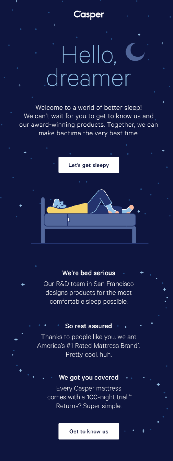
Why we love it: What’s the first thing you noticed about Casper’s welcome email? I’m willing to bet it was the deep blue color.
On brand, relaxing, with the text contrasting to stand out? Yes, please. The color conveys exactly what the brand is all about, without overwhelming the subscriber. It makes you look forward to future correspondence from them with the hope that each email will be as creative as the first. And the cherry on top? The little sleep-related puns.
Why you should try it: Colors are very important for brand recognition and consistency. I’m sure at some point you’ve opened up an email and immediately deleted it because the colors were just throwing you off. You don’t want your subscribers doing the same, and color goes a long way to keeping them engaged.
There is a lot to consider when choosing colors, like how they reflect your brand, how they look together, if they stand out enough but aren’t too overwhelming. Our psychology of color blog post should be able to help you out.
5. Glossier - Let’s get social

Why we love it: Welcome emails are a great way to introduce new subscribers to some of the other channels you may be operating on, like social media. Glossier does a great job of keeping their text to a minimum, but still promoting a way to further interact with their brand. Showing their Instagram feed at the bottom not only adds to the overall aesthetic, but also entices you to connect with them on another platform.
Why you should try it: So they’ve signed up for your newsletter, and they’ll be getting regular correspondence from you through that. But, moving them onto your social media channels puts you in their orbit even more often. You’ll have more chances for conversion, and the greater the brand recognition the more they interact with you.
6. HelloPrint - The human element

Why we love it: Email can feel so robotic sometimes. It’s in the name: electronic mail. So sometimes the brands that add a human element to their marketing stand out more. Take a look at how HelloPrint introduces the new subscriber to the customer service team. Introducing you to Danny, Mary and Martha puts a face to your brand, and makes them seem more trustworthy in the eyes of a customer. (Also...peep the personalization at the beginning.)
Why you should try it: You want people to trust your brand, but it’s hard to trust something that you can’t put a face to. Showing your customers that there are humans behind the machine can make them like you, and want to work with you, a little bit more. Introduce them to some members of your team, like customer service so they can see who they might be working with in the future.
7. Mode - Get them interacting
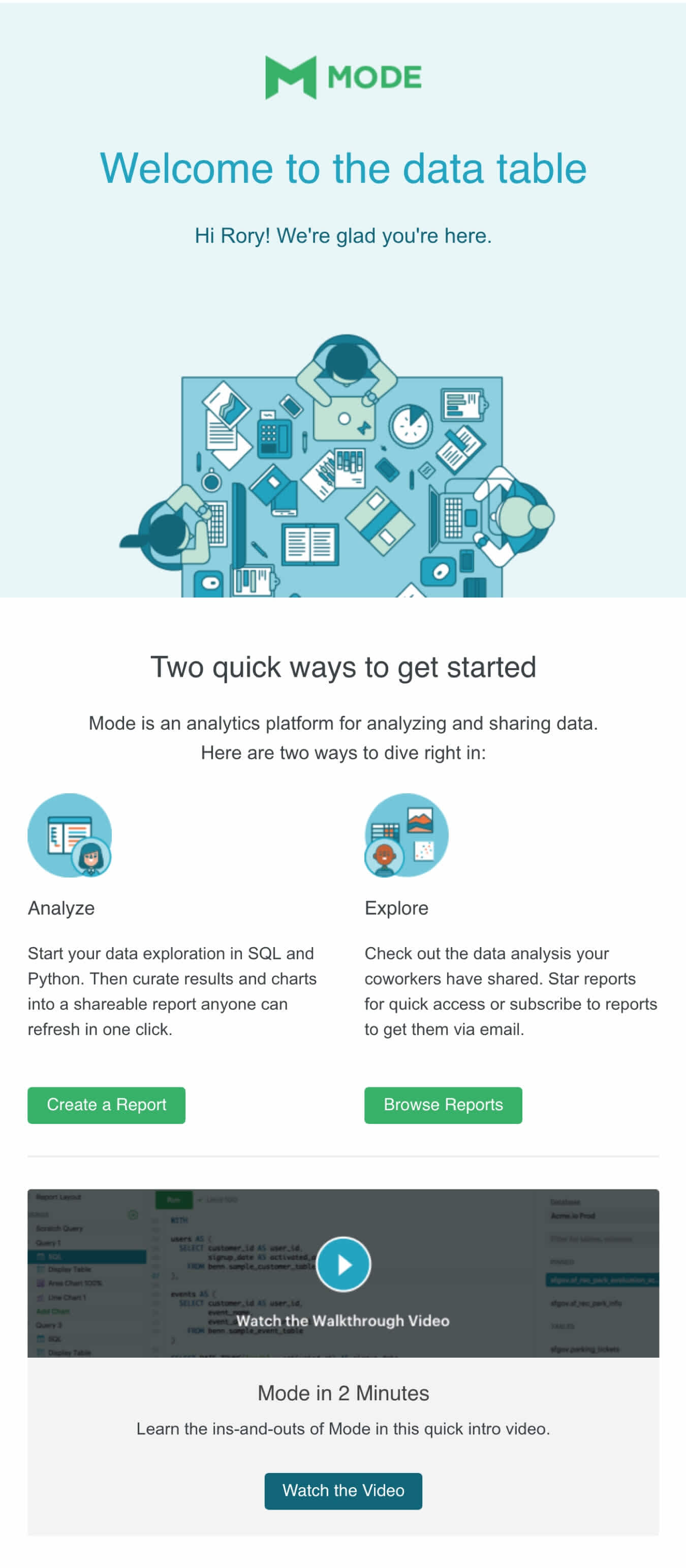
Why we love it: Never underestimate the value of interactives! In Mode’s welcome email, they include a tutorial video. This email acts as a one-stop-shop to learn more about the brand you just subscribed to, gain some tips and tricks on how to use it, and then get started putting your new knowledge to work! All packed up into a 2 minute video… phew!
Why you should try it: When you hit the inbox, you want your email to stand out from all the other emails fighting for your customers' attention. A good way to do this is through interactives, like videos, that are hard not to click on. However, make sure that whatever you add to your welcome email, be it text or interactives, adds value. You don’t want to lose your audience by having too much content.
8. Uber - Deliver the incentives

Why we love it: If signing up to your newsletter came with an incentive, you might want to take a couple notes from Uber’s welcome email. The incentive “Your free Uber ride is waiting” is as hard to miss as it is to resist. Following it up with a short explanation of what the incentive includes and topping it off with a CTA that helps the subscriber redeem the reward makes it so easy. SO easy in fact that there’s no reason not to use their product, right?
Why you should try it: Adding incentives like special promos for new users or access to exclusive content can really draw in subscribers. It adds an extra bit of value for signing up for your newsletter and will get them trying your brand. However, if you do offer an incentive, make sure you deliver on it.
9. Sidecar – Your mission
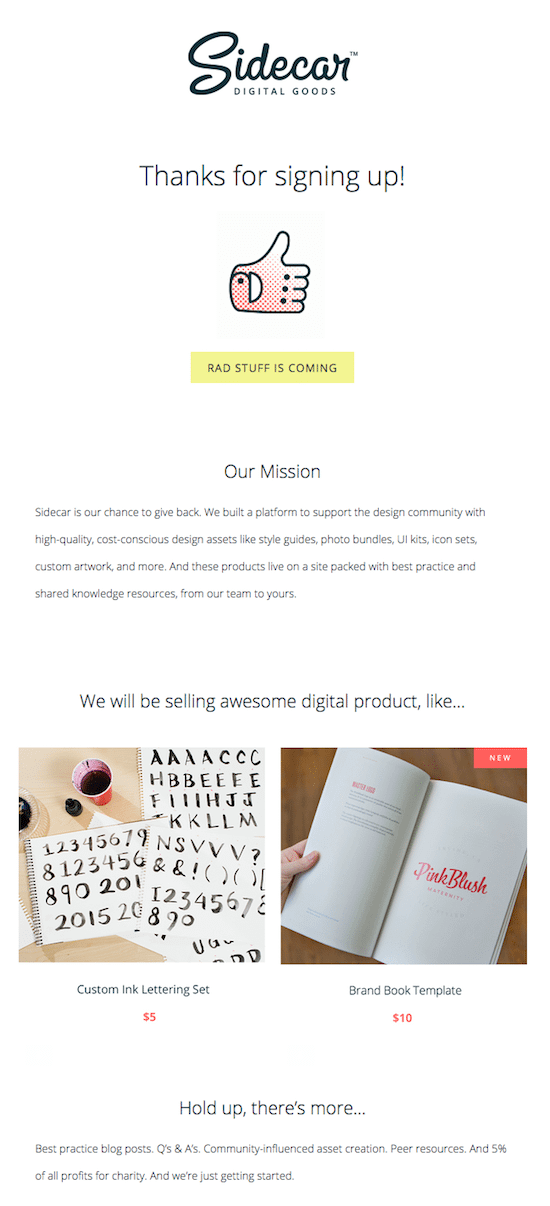
Why we love it: Talking about kicking things off on a good note. Sidecar immediately thank subscribers for signing up, before informing them of what type of content they can expect to receive.
They also take the time to introduce their mission statement, providing subscribers with a clear understanding of the company's purpose, values, and what it stands for.
Why you should try it: Kicking things off with a mission statement can help build trust and loyalty, as customers will be more likely to support a company that aligns with their own beliefs and values. Additionally, it can help to differentiate your business from competitors and create a positive first impression.
10. Aura Bora – Welcome discount code

Why we love it: Did you know, that one of the primary reasons subscribers sign up for a newsletter is to receive some form of discount or code?
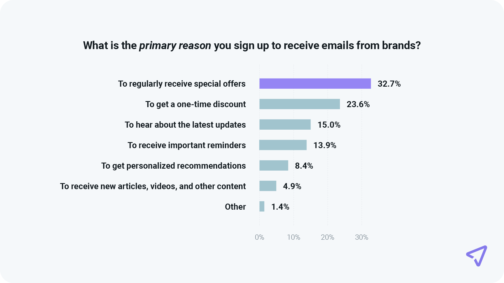
According to data from our research report, The path to email engagement 2024, The top three reasons for signing up for a brand’s emails were To regularly receive special offers (32.7%), To get a one-time discount (23.6%), and To hear about the latest updates (15%).
Why you should try it: Give the people what they what! With over 50% of consumers signing up to receive either a one-time discount or regular special offers, you can bet a fair share of your audience is looking for the same thing, too.
What is a welcome series?
So, you’ve heard all about welcome emails. Why not take it to the next level and try a welcome series?
A welcome series is a succession of welcome emails that are staggered, instead of sending out just one. Well, why should I send out multiple emails instead of just one? It’s a good question, and the answer is that you don’t want to overwhelm your new subscriber with a ton of info in your welcome email.
Instead of overwhelming them with an extra long email, stagger out the onboarding info so they are more likely to interact with it.
Sending out the first email as soon as they sign up that has some easy, preliminary info to begin the onboarding process would be step one, like a thank you for signing up and a subscription confirmation. Then, the next day, send out email two that has a couple more steps, like maybe set their email and profile preferences, and links to social media. Day three, send out another with popular products or something easy they can try so they familiarize themselves with your product or service.
Sending welcome emails with Sinch Mailjet
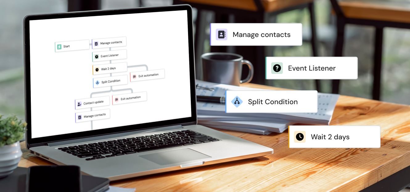
With Sinch Mailjet, it’s easy to send out your welcome emails. It’s even easy to send out a series of welcome emails, if that’s more your style. Our Email Automation tool lets you set up a workflow that will send out an email, or a series of emails, based on a specific action. In this case, subscribing to your newsletter.
To begin, click on ‘Automation’ in the main menu and then click ‘Create my first workflow’.

Select the ‘Welcome’ automation scenario and fill in the workflow details for the welcome email you’re going to send out. Once that’s done, select the contact list that will be the trigger for you workflow. Don’t forget to hit ‘Save and continue’.

Almost time for the creative part! Click the ‘+’ button to begin designing your email. Right before you head to our email editor, Passport, to begin designing like usual, you will have to choose if you want there to be a delay for sending out your email. We suggest you send it immediately, but it’s up to you.

Now it’s time to get designing. Keep all of our tips and tricks in mind while building your email, and get as creative as you want within Passport. Once you’re all done, you’ll be taken back to the ‘Customize your workflow’ page where you’ll hit ‘Save and continue’.
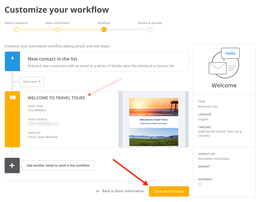
But hold on a second. Before you activate your workflow, make sure all your emails have been tested and the workflow details have been reviewed. Maybe even get a second pair of eyes to look it over if you can. Once the workflow has been activated, it cannot be modified.
Once you’re happy with it, click ‘Save and activate now!’
And that’s all there is to it!
If you want to send out a welcome series, you would add more emails in the workflow, and set a delay for them to be sent 24 hours after the sign up, or however you want to stagger them out.
Wrap up
Welcome emails aren’t just a way to say hello to a new subscriber (but it’s still a very important part of them!). They are also a way to further engage your customers, show off what your brand is all about, and maybe get them even more involved. From the CTA, to the colors, to the personalization, adding these elements will make sure your subscribers are looking forward to what’s to come.
