Email best practices
How to test responsive email design
When an email doesn’t have a responsive design, it may not display correctly on different devices, operating systems, or screen sizes. That’s why email responsiveness is essential for an effective marketing campaign.

PUBLISHED ON
As an email marketer, you want to reach a broad audience who are interested in what you have to say. This entails compiling an email list of interested subscribers, personalizing the content you send, and analyzing data to find out what works best.
But what if you follow all those practices, yet some recipients can’t open your messages? This can be a possibility when you don’t design responsive emails, depriving you of a conversion. When an email doesn’t have a responsive design, it may not display correctly on different devices, operating systems, or screen sizes.
That’s why email responsiveness is key for an effective marketing campaign. That way, your email templates have functionality across mobile devices, laptops, and tablets, and you maximize your opportunities for click-throughs.
Importance of email responsiveness
Imagine your company spent several hours creating an ideal email marketing campaign. You tested multiple designs, performed market research, and analyzed multiple statistics. Yet, you left out responsiveness, and a large proportion of your audience can’t don’t open your messages. That’s an example of the importance of email responsiveness and why it’s vital when you want every recipient to view what you have to say. With the number of cell phone users reaching six billion in 2022, mobile responsiveness is fundamental to successful email marketing.
We must ensure our design renders across all devices. Consumers are always on the go, with mobile email engagement surpassing that of the computer. Studies have found that 49% of users opened emails on phones in 2021.
Responsive design can seem like an overwhelming task, especially as the number of new devices continues to grow on a monthly basis. How do you know how the email will render on apps like Gmail or operating systems like iOS and Android? What are media queries and CSS, and how can I use them in a responsive HTML email template?
Here are three easy ways to start testing the responsiveness of your designs today:
Steps to assess email responsiveness
1. Test them out
The most traditional way to make sure email campaigns render across devices is to physically test them on these devices. Most major email service providers (ESPs), like Mailjet, allow you to send a test email to yourself and a few colleagues before blasting your campaign.
This method is helpful if you can send the test to a few coworkers with access to various devices, browsers, and operating systems. Having an extra pair of eyes reviewing content and testing the user experience facilitates valuable feedback.
2. Take advantage of features
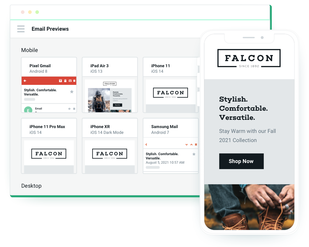
Use the preview panel in your ESP account to see how your email takes shape across different devices. With Mailjet, after designing your campaign, you can view the completed product on three devices – mobile, tablet, and desktop/laptop.
A responsive design will have images and text that change size accordingly. The most common design is a stacked column approach, where boxes of content can easily scale without much shifting across screen sizes. To learn more, head to our quick guide on creating responsive email campaigns.

3. Try third-party providers
Finally, to ensure emails are thoroughly tested on all major email clients, we recommend complementing steps one and two with a platform like Email on Acid. Every email client has its own way of rendering campaigns.
Email on Acid sends your email to more than 50 email clients and provides you with analytics and previews, saving you time and worry. It can also perform spam testing, optimization, and deliverability. This will help you know that your content will reach your right customers’ inbox.

Email responsive design best practices
Now that we’ve let our secret out of the bag and shared our three steps to testing, let’s take a look at the most efficient ways to do it.
Don’t forget small screens: For an email to be truly responsive, it has to load on any type of screen, including small ones. When creating a responsive email, it’s essential to consider all screen sizes so all recipients can access and view your message.
Call-to-action (CTA) placement: The goal of marketing emails is conversions and click-throughs, making your CTA’s location one of the priorities. For that reason, resizing CTA buttons for mobile ensures users can easily find them and seek more information about your brand.
Use a single-column layout: Emails with a clean, straightforward design better draw recipients toward essential information than complex messages with a disorganized layout. Formatting using a single column gets your message across in a straightforward fashion and will better fit on a mobile device’s screen.
Adjust image and text size: For a marketing email to fully convey its content on a mobile device, images and text have to be correctly rendered. Resizing images and text for smaller screens on mobile devices ensures that all users can read what you have to say.
Show or hide different elements: It isn’t a requirement that emails look exactly alike on desktops and mobile devices. When creating a responsive email, you can adjust the layout and add or remove elements so it loads more effectively.
There you have it! With these tips and best practices in mind, you’ll be sure to ace your next email design with flying, responsive colors.
Remember, Mailjet has everything you need to create professional, responsive emails without learning complex software. Our intuitive drag-and-drop Email Editor makes designing appealing templates easy, and our testing tools help you select the layouts that work.


