Marketing
Lead capture landing pages: What are they and how to create them
Want to know more about email capture landing pages? In this guide we’ll walk you through what they are, how to create them, and provide additional examples to inspire your next campaign.

PUBLISHED ON
If you've ever found yourself browsing the web and stumbled upon a page offering a free eBook, webinar, or product demo in exchange for your email address, then you've encountered a lead capture landing page in action.
But what exactly are they, why are they so important to your lead generation strategy, and how can you create one that converts visitors, into valuable leads? Fear not, dear email marketer, for all is about to be revealed.
Table of contents
Target specific audiences
Increased conversions
Nurturing relationships
Cost-effective marketing
Improved ROI
Keep the lead capture form short
Leverage the power of social proof
Offer value through a lead magnet
Ensure your value proposition stands out
A/B test your landing pages
What is a lead capture page?
A lead capture landing page is a dedicated web page readers are sent to after clicking on a specific link. The primary goal of a lead capture page is – as you’d expect from the title – to convert potential leads into customers. This is typically done by encouraging people to take a certain action, such as signing up for a webinar, subscribing to a newsletter, or downloading an industry whitepaper.
This goal can change from business to business and industry to industry. For example, an ecommerce brand is more likely to be interested in sending readers directly to a purchase page. The sales cycle is a lot shorter, and customers don’t typically require much nurturing.
For a B2B SaaS company, on the other hand, with a longer more complicated sales cycle, it might be more beneficial to encourage people to sign up to a weekly newsletter where they can then be steadily nurtured with valuable, relevant content.
Whatever the goal is, a lead capture page essentially facilitates an information transaction between reader and brand. Potential customers part with their email addresses in return for something of perceived value.
Why are lead capture pages important?
So, we’ve established what a lead capture page is, but why is it so important to email marketers? Why can’t we just direct people directly to our homepage?
Well, the simple answer is they serve two different purposes. A homepage is like a sort of brochure for your business – it lets visitors understand who you are, what you offer, and why you exist.
However, when you’re running a marketing campaign encouraging people to attend an event or discover more about a newly released product feature, the homepage isn’t an ideal place to send them. The information there is too generic and potentially confusing.
A landing page, on the other hand, can be custom built to achieve your specific goal – encourage readers to exchange their email address for valuable content. They are one of the most effective lead generation tools in an email markets arsenal.
Must read: Looking to improve the performance of your lead capture landing page? We recently put together a complete A-Z guide on landing page optimization which goes through 8 key best practices you’ll want to apply to your next campaign.
What are the benefits of a lead capture landing page?
We’ve established that the primary benefit of a lead capture landing page is its ability to generate leads by collecting visitor information. This is typically achieved by offering something valuable in exchange for contact details (such as an ebook, webinar, or discount) which can then be added to an email list or CRM system.
But what are some of the other benefits of lead capture pages? Let’s go through a few of them below:
Target specific audiences
Lead capture landing pages allow you to target a specific audience segment based on interests, demographics, or behavior. For example, imagine you want to run a campaign for your Spanish-speaking audience in Spain. Typically, you run these campaigns for your audience in LATAM, but the subtle linguistic and cultural differences make a one-size-fits-all campaign ineffective.
By creating a landing page, you can optimize the messaging, design, and feel to ensure it resonates with your audience and increase the likelihood of conversion.

Increased conversions
As mentioned previously, lead capture pages are designed with a single goal in mind: to convert visitors into leads. They are optimized for conversion by removing distractions, using compelling copy and visuals, and making the opt-in process as simple as possible for visitors.
This focus on conversion optimization typically leads to higher conversion rates compared to other types of web pages.
Nurturing relationships
Once a visitor becomes a lead by submitting their contact information, you can use landing pages to nurture these relationships over time. Just because someone has handed over their email address doesn’t mean they’re ready for you to hit them over the head with your product right away. Give them time and gently introduce them to your brand.
You can send targeted follow-up emails, provide additional valuable content, and gradually guide them through the sales funnel towards making a purchase.
Whatever your goal, you need to make it easy and compelling for people to do so. Try creating a consistent path, synchronizing the email to landing page experience for higher conversion rates.
Cost-effective marketing
Compared to traditional advertising channels like print or TV ads, landing pages offer a cost-effective way to acquire leads. Businesses can drive traffic to their landing pages through various digital marketing channels such as email marketing, social media, search engine optimization (SEO), and pay-per-click (PPC) advertising, often at a lower cost per lead.
Improved ROI
By combining targeted audience segmentation, conversion optimization, and measurable results, lead capture landing pages can deliver a strong return on investment (ROI) for your business.
What’s more, they can be continually refined over time. Landing pages easily lend themselves to be A/B tested, with almost every element from CTAs and design to messaging and content up for tinkering. Combine this with the ability to track and optimize campaign performance, and you can see why they maximize ROI over time.
Julia Ritter and Natalie Lynch of Sinch Mailjet shared insights on maintaining consistent branding across all customer touchpoints in their recent Email Camp 2024 session: Uniting your signup forms, emails, and landing pages with cohesive branding
Best practices for creating high-converting email capture landing pages (with examples)
There’s more to creating an effective landing page than installing a pop-up on your website and driving people to a hastily assembled URL (unfortunately). There are certain best practices you’re going to want to keep in mind to maximize conversion rates and acquire as many high-quality email addresses as possible.
We’ve put together a list of them for you below:
Keep the lead capture form short
One of the most common mistakes we see businesses make is asking for too much information on a lead capture form: phone number, job title, industry, team size, age, location, pain point, etc. While obtaining this data provides invaluable insight into your customers and potentially allows for greater email list segmentation, that’s only possible if they actually fill out the form in the first place.
The problem is long forms can be daunting. People haven’t got the time – or probably more accurate to say, patience – to fill them in. So, if they see a bunch of mandatory data fields they’re required to fill in to get access to your content, they’ll simply exit the page and leave. By keeping the form short, you reduce friction in the conversion process, making it easier and quicker for visitors to provide their information.
Also, long lead capture forms may lead to lower-quality leads. Website visitors may provide incomplete or inaccurate information just to expedite the process. Shorter forms tend to attract higher-quality leads who are more willing to provide the necessary information without feeling overwhelmed.
So, what data fields should your email lead capture form contain? Name, email (clearly), and – if you feel it absolutely necessary – one more (max).
Pro tip: To ensure a healthy and active contact list, you should always use a double opt-in form. This is where new subscribers receive a confirmation email after subscribing to your email list, effectively meaning they confirm their subscription twice. Find out how to implement a double opt-in process.

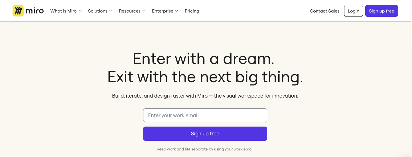
Notice how Miro only ask for a single email address to try out their platform
Leverage the power of social proof
Another powerful effective way to increase the success of your lead capture landing pages is to add social proof. Remember, most people arriving at your landing page probably know little to nothing about your brand. They’re going to have to take the claims you make at face value, and we’re not always the most trusting of people, are we?
What social proof does – such as customer testimonials, case studies, product reviews, and user ratings – is provide validation and reassurance to visitors. When potential leads see that others have had positive experiences or found value in your offering, they are more likely to trust your brand and feel confident in handing over their contact details.

Notice how Bob Meijer gathered customer testimonials to reinforce confidence in his brand and services.
Offer value through a lead magnet
This might sound overly obvious but for your landing page to work and succeed in capturing leads, you have to offer something valuable in return. There must be an incentive for people to hand over their contact details.
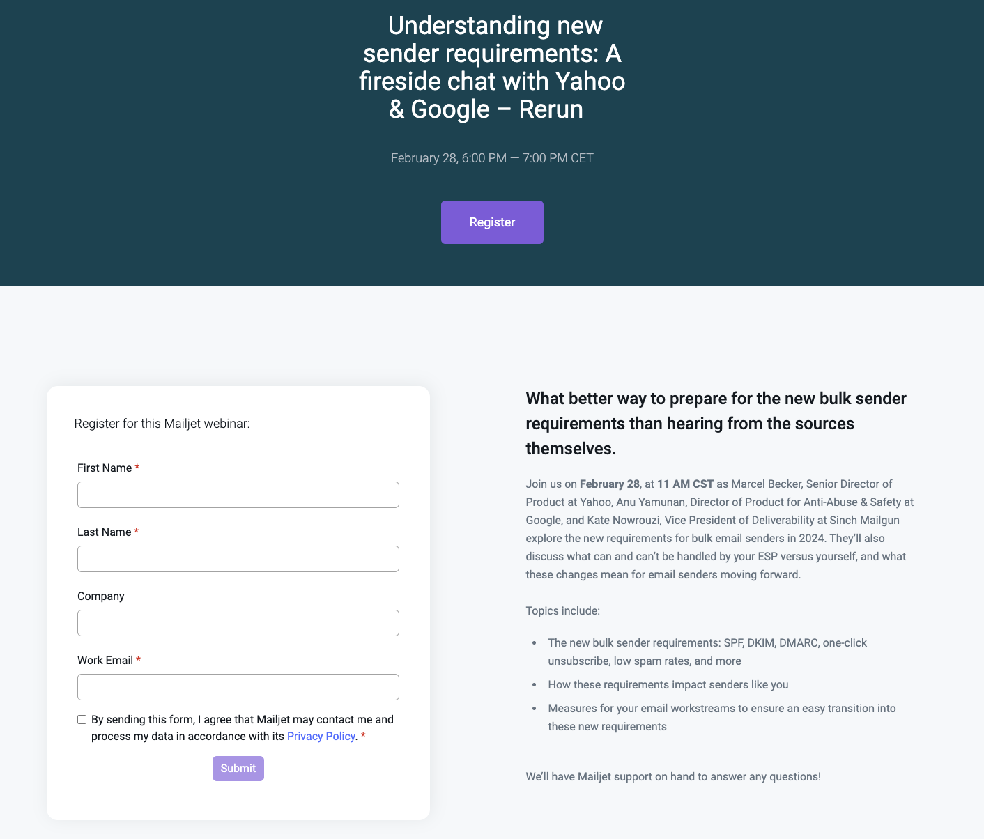
For example, at Sinch Mailjet we hosted a webinar on the February 2024 Google and Yahoo changes around email deliverability. We invited Marcel Becker, the Senior Director of Product at Yahoo and Anu Yamunan, the Director of Product for Anti-Abuse & Safety at Google to hold a Q&A session with our customers to uncover exactly how these changes will impact email senders. It was an incredibly helpful session for our customers as they could speak directly to representatives from Google and Yahoo.
As it’s a resource we’re confident people will find a lot of value in, we created a landing page to gather people’s contact details to inform them of possible changes, updates, and other relevant content around the subject.

An exchange of contact details for access to a unique webinar on a relevant industry topic is a great example of when to create a landing page
Ensure your value proposition stands out
In today's fast-paced environment attention spans are limited – especially when it comes to online browsing. People want to know:
What exactly it is your offering
How it benefitsthem
Why they should care
If this information isn’t clear and obvious after arriving at your landing page, they’ll bounce. Therefore, a compelling value proposition immediately grabs the attention of visitors and communicates the unique benefits or solutions your product or service offers.
Also, it helps set clear expectations. It clarifies the benefits they can expect to gain from engaging with your brand, whether it's receiving valuable content, solving a specific problem, or accessing exclusive offers. This transparency helps to build trust and credibility with potential leads.

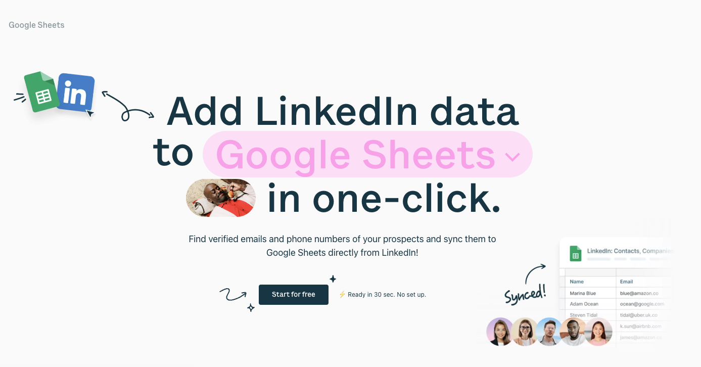
Surfe do a great job of not only clearly defining their value prop, but make it impossible to miss on their landing page
A/B test your landing pages
As British physicist and mathematician Thomas Kelvin said, “What is not defined cannot be measured. What is not measured, cannot be improved.”
While it’s highly unlikely he was referring to landing pages, his statement still holds true for email marketers. If you are unable to test measure the success of your landing pages, how do you know if they’re working, or not? This is where A/B testing comes in.
A/B testing allows you to optimize your lead capture forms by testing different elements such as form fields, copy, design, messaging, and CTA buttons. You can identify which variations perform best in terms of conversions and use that data to inform your future decision making.

Running an A/B test on an element as simple as different CTA texts or colors can have a huge impact on conversion rates
Create landing pages with Sinch Mailjet
So, we’ve established just how important lead capture pages are for your business. They serve to guide customers towards a specific product, service, or offer, and encourage them to act. But how can you swiftly introduce them into your current email marketing strategy?
To simplify this process, Mailjet will soon offer a drag-and-drop landing page builder built directly within our email marketing platform. With our new tool, you will have access to pre-built templates that are easily optimized to closely align with your email marketing campaigns. You can seamlessly integrate forms – including custom fields – to collect valuable visitor data as well as sync leads with email lists, allowing for targeted follow-ups and nurturing.
Build landing pages directly within Sinch Mailjet
You can now build and integrate stunning, high-converting landing pages directly into your email marketing campaigns. This creates a seamless and cohesive experience for your subscribers from the moment they open your email right to the point of conversion.


